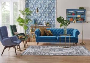
Some people find it challenging to pull a room together in a way that feels balanced and makes a statement. Here are a few tips for decorating you can follow to create your own WOW factor, like a pro.
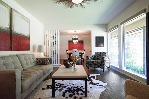
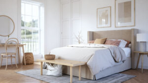
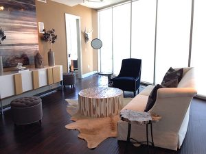 One thing I always pay close attention to in a space is balance. What I mean by that is to not get too caught up in one thematic element – like everything in the room being a shade of white or cream. Or worse, everything in the room being a variation of the same color. Monochromatic rooms can be attractive but they can also be boring. Add some contrast to the palette to move the eye around. That doesn’t necessarily mean color (although it could). You can have a neutral color palette and still incorporate contrast for visual interest. Imagine shades of gray and cream strategically placed throughout.
I will usually incorporate some color into my designs. That is just a “me” thing. You can always use a neutral as your base and add a couple of companion colors for drama. Be careful not to get carried away with too much of one color. You are safer leaving the viewer wanting more than the viewer wanting less. Too much and it can start to look like a confused rainbow explosion in short order! My rule of thumb is to keep your bigger staple items more neutral. Then add a few splashes of color in the accessories. To top it off, I usually go big and bold with the art for extra impact! Art is like the perfect scarf. It can pull all of the colors together and dress things up!
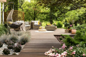
Also, think about masculine/feminine balance. If your space starts feeling like a baby shower is about to erupt, you might want to add some masculine features to counter the girly energy! Add something sculptural with sharper edges or something chunky and weighty next to a more delicate ornamental piece. Add some organic elements like wood or stone on a glass table. Basically, if you feel you are gravitating too much in one creative direction, head the other way for a bit. A gender-balanced space will feel inviting to everyone and appeal to the widest audience.
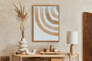
Finally, throw in a little “old meets new” for a more collected look. The displays you see in all of the national chain furniture stores…I call it the “big box effect,” when everything in a space looks new and shiny and matchy and predictable. Not good. To avoid this, mix in some of those fabulous pieces we of a certain age have acquired or inherited over the years. Antique or vintage pieces add depth and interest to a room. They tell a bit about who lives here and their history. A piece with a story behind it always makes a space feel richer and more interesting.
Just think of your room as a cake recipe where balancing all of the right ingredients ensures a successful result that does not fall flat. Everyone loves cake!

