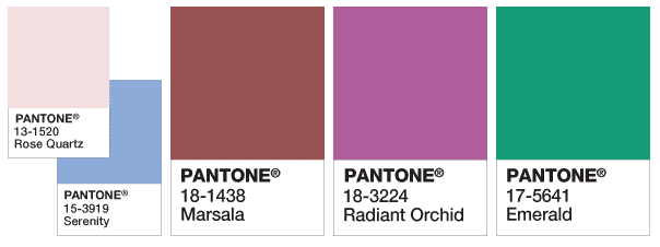
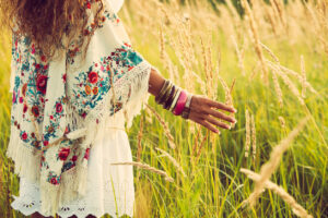
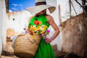
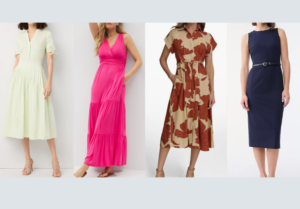
In the past several years, Pantone has played about the cooler end of the color spectrum. Baby and fuchsia pinks, periwinkle blues, and rich maroons have ruled the palette planet.
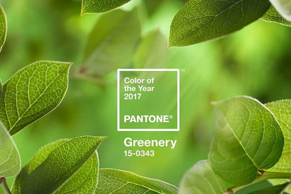
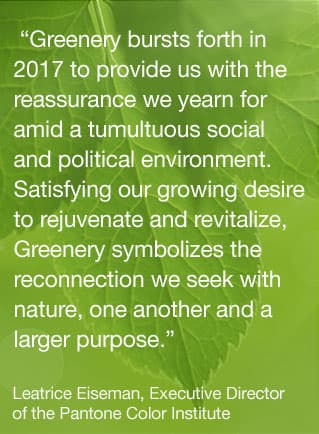
For 2017, get to know the Pantone Color of the Year, GREENERY! A refreshing and revitalizing shade, Greenery is symbolic of new beginnings, evoking the first days of spring when nature revives, restores, and renews.
Greenery is nature’s neutral. The more immersed people are in modern life, the greater their innate craving to engage in the physical beauty and inherent unity of the natural world. This is reflected by the proliferation of all things expressive of Greenery in daily lives through urban planning, architecture, lifestyle, and design choices globally. A constant in the periphery, Greenery is now being pulled to the forefront – it is an omnipresent hue around the world.
Illustrative of flourishing foliage and the lushness of the great outdoors, the fortifying attributes of Greenery signals consumers to take a deep breath, oxygenate, and reinvigorate.” ~ PANTONE
But, it’s not easy being green ?
ATTIRE
No matter your skin tone, this is a tough shade to carry head-to-toe. So, unless you’re SUPER brave, start small by looking for jewelry, accessories, and cosmetics to bring in the spring.
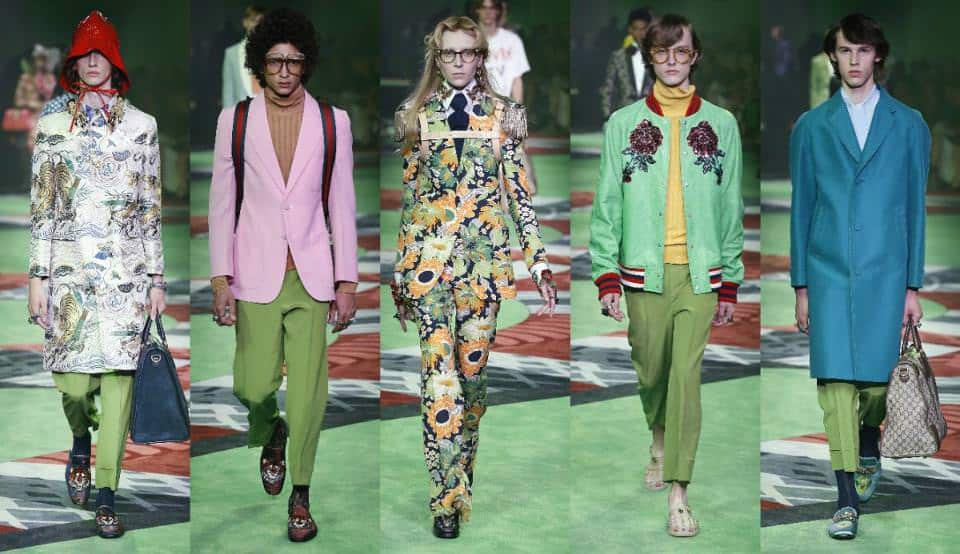
The shade could be seen at Balenciaga, where it was worked into a horticultural-themed jumpsuit, and at Louis Vuitton, where it formed the basis of a head-to-toe asymmetrical cut-out trouser suit with modern black accents. Etro worked it into chunky embroidered kaftans for a bohemian aesthetic, and Lacoste used it unapologetically for monochrome structured tops and raincoats.
Greenery was especially prominent on this next season’s SS17 runways. The color in all shades and hues walked in various forms at SS17 Gucci, Kenzo, Bagelencia, Michael Kors, Zac Posen, and Cynthia Rowley.
The major fashion houses styled their Greenery in various ways, wearing it monochrome for extra impact or as a mishmash of vibrant clashing hues for a summery vibe. However you decide to wear yours, this is the season to indulge your inner green-eyed monster.
INTERIORS
In case you just can’t wear green, take your style indoors… Consider updating your art and interiors by bringing the freshness of the outdoors inside.
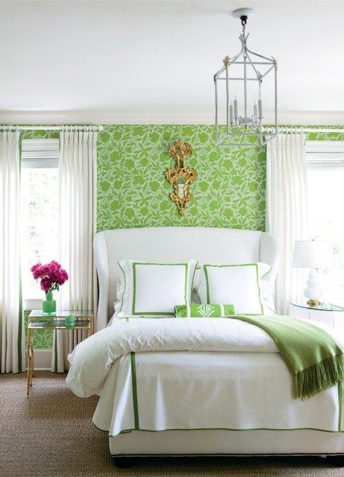
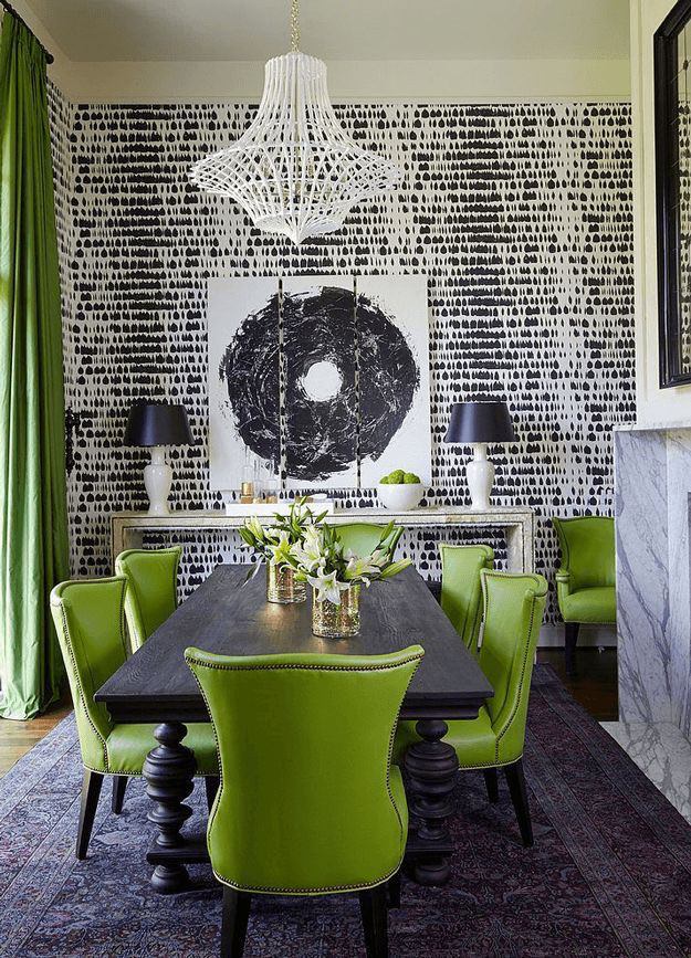
This isn’t your “green with envy” green, and unlike 2013’s color “Emerald” which symbolized luxury, Greenery taps into the opposing idea… minimalism through our most basic environment, nature.
Nature’s neutral, PANTONE Greenery is a versatile ‘trans-seasonal’ shade that lends itself to many color combinations. As displayed in the palettes below, Greenery is paired with neutrals, brights, deeper shades, pastels, metallics and even the enduring presence of PANTONE Color of the Year 2016, Rose Quartz and Serenity. These palettes easily cross over fashion, beauty, product and graphic design applications.” ~ PANTONE
Ultimately, fresh for your New Year’s Resolutions, Greenery calls to mind all the positive “re-” words:
- Refresh
- Revive
- Restore
- Renew
- Replenish
- Regenerate
- Rejuvenate
- Reinvigorate
- Re-oxygenate
Through the Pantone Color of the Year, Greenery, creative design in fashion and interiors is an outlet for all these fresh beginnings.
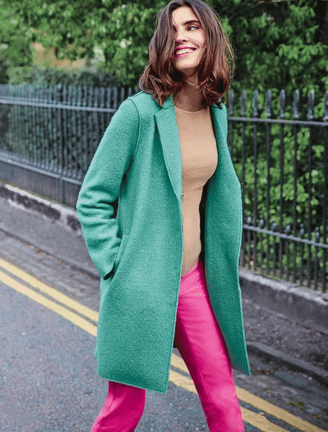
Here’s how to SHOP the Pantone Color of the Year in clothes:
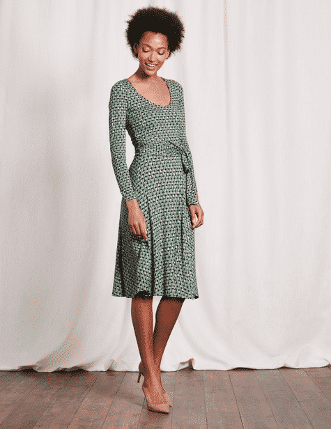
Boden
$69-$110
Boden
$83-$104
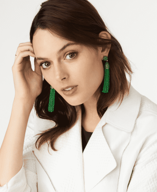
BaubleBar
$36
Banana Republic
$48
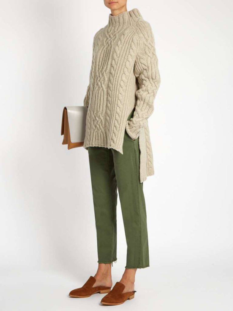
Nili Lotan
$317
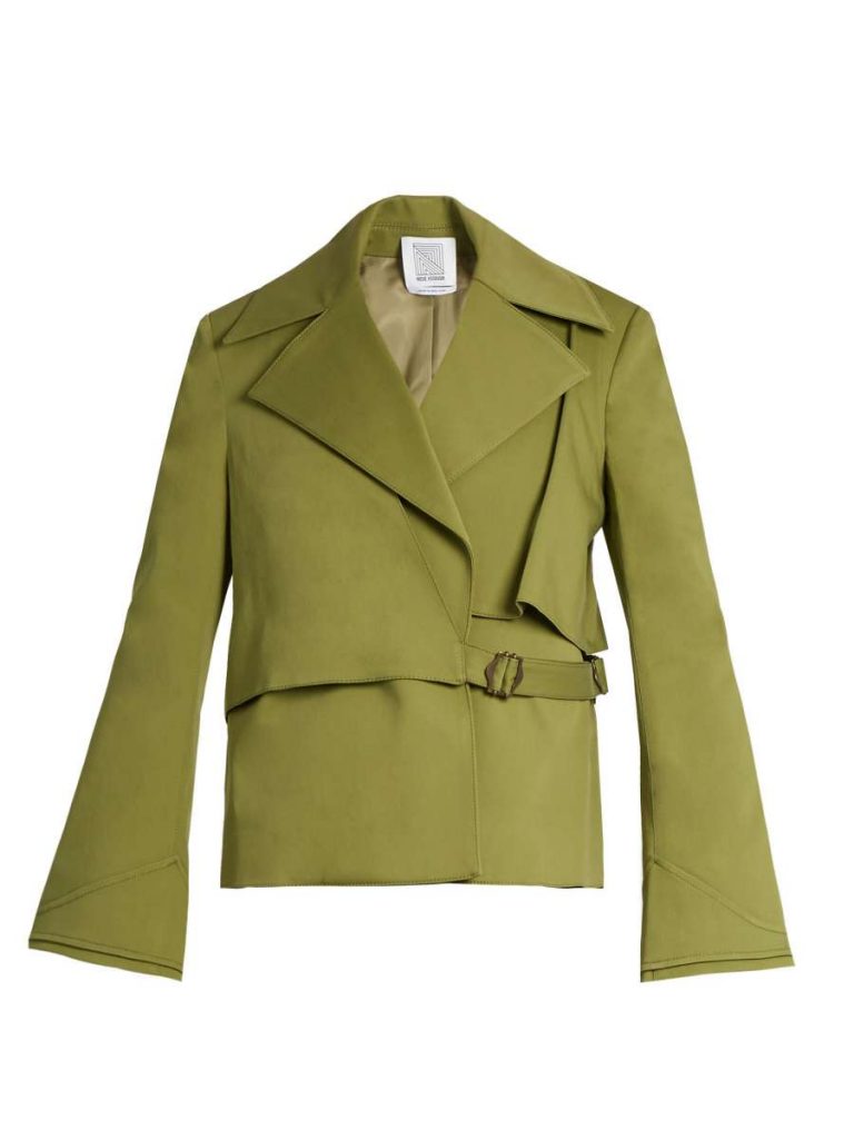
Rosie Assoulin
$998
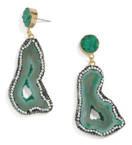
BaubleBar
$58
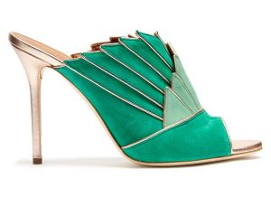
Malone Souliers
$604
Prime Women magazine

