History of Color
Humankind has been trying to understand color and its best use for millennia. Circa 1665, Sir Isaac Newton experimented with light by passing it through a prism. Newton observed the various colors that fanned out into a rainbow of color and decided there were seven main colors: red, orange, yellow, green, blue, indigo and violet. He had the brilliant idea to depict the color spectrum as a circle, thereby creating a precursor to the color wheel that we know today. Ever since then, humans have been fascinated with color associations and their meaning.
The Influence of Color
It’s important to understand that science can go only so far to explain the effects of color on the beholder.
Color associations are deeply culturally influenced. For example, when I first attended a Chinese/American wedding, the bride wore a traditional red dress to evoke good luck and happiness. On the other hand, I wore white to my wedding, which is the custom in the United States. Cultural norms determine whether we think white or red is the proper color of a wedding dress. Color associations are also shaped by individual experiences and memories. We all have color connotations, whether it’s the color of your mother’s bedroom or your father’s favorite car. Therefore, color is linked closely with culture, memory and emotion. Color psychology is still a new area of scientific study, but the concept that colors affect humans’ mood and even behavior is old, well-known and experientially confirmed.
The symbolic importance of color was vividly impressed on me when I consulted with Lowe’s, the hardware retailer, whose brand colors are blue and red. I heard the story from them of how a newly hired executive showed up to work one day wearing a muted orange shirt. (Orange is the brand color of Lowe’s toughest competitor, Home Depot.) The executive was sent home to change his shirt because at Lowe’s, no one wears orange. Color has impact and meaning!
>READ: BRAND STRATEGY 101: YOUR COMPANY LOGO IS NOT YOUR BRAND
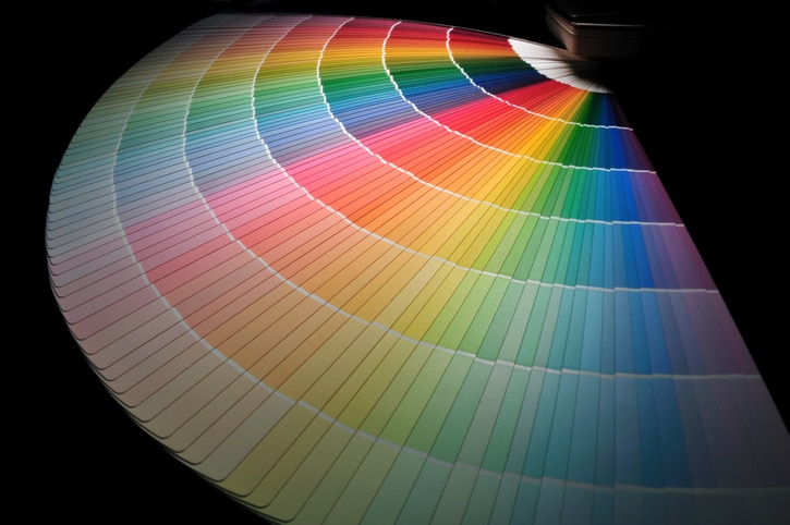
The Color Wheel

The color wheel teaches us that colors are cool or warm. Cool colors include blue, green and violet and are calming colors. Warm colors such as red, yellow and orange, excite and energize us.
Some scholars divide colors into those that are activating (stimulating brain wave activity) and those that are evaluative or affective (that cause you to like something). Warm colors such as red and violet have an activating influence, while green and blue seem to be more likable colors. This can be a good litmus test of what color to choose: do you want to energize someone or create a sense of liking in that person?
Typical Color Associations
Awareness of color associations is helpful in many circumstances. Whether picking out an outfit to wear to an important meeting, painting your bedroom or designing your company’s brand or logo, it’s important to understand color and the emotions certain colors evoke. Here’s a much-simplified guide to the colors and what emotions they typically evoke in the United States:
Red
Red is a warm and activating color. It connotes the warmth of a fire, the strength of love and commitment, strength and vitality. In clothing, it can portray a sense of confidence and power.
Companies that use red predominantly in their branding include Coke, Target, CNN, and Kellogg. Sports teams love to wear red because of its power connotation. However, too much red can be overwhelming to the senses. In fact, in one consumer study, shoppers were more attracted to a blue-colored store than a red one. Red is best used in small doses, as attention grabbers and calls-to-action, in both personal and professional arenas.
Blue
What’s the color of police uniforms? Blue, of course. Blue connotes competence, trustworthiness, likability, and calm. As stated above, shoppers were attracted to blue-themed storefronts. You might want to wear blue, especially navy, the next time you want to appear trustworthy and likable. However, too much blue can make you, well, blue or sad, so use blue in moderation.
Companies that use blue in their logos include Ford, IBM, and Dell. Ford’s reliable brand message: You can count on your Ford Focus to start each morning!
Yellow
This color connotes morning sunshine, happiness, and positivity. Unfortunately, yellow is highly stimulating and can fatigue our eyes due to its intense brightness. For example, babies tend to cry more in yellow rooms. It’s high energy is also best used in small doses. The effects of yellow are highly individualized, so to one person, it can be energizing while to another it might be tiring.
Companies that use yellow in their branding want to stand out and catch your attention. Because of its intensity, yellow is often combined with a darker color to make it pop. Some examples of brands that use yellow are Cheerios, McDonald’s, Ikea, and Nikon.
Green
Green can make you think of a forest, of vibrancy, growth, fertility, and money. It can also represent tranquility, health, wealth, and envy. It is a cool color on the color wheel, so it is more calming than the warm colors like red and yellow. It can relieve stress. Demonstrating green’s calming effect, many performance halls have a “green room” backstage, where the artists wait before appearing on stage. The tranquility of the green room calms their nerves before the performance.
Companies that wish to appear natural, wholesome, and good for the environment might choose green in their branding. Notable green logos include Starbucks, Whole Foods, Tropicana, and BP.
Orange
Another warm color, orange has characteristics of both red and yellow, which are the colors an artist would mix together to create orange. While it is an attention-grabber, it has a more playful feel than does its parent color red. Orange can represent excitement, fun, happiness, enthusiasm and warmth. Because of its high energy, many sports teams use orange in their branding and uniforms. In the U.S., orange is associated with the color of prison uniforms, whereas in other countries, it symbolizes royalty and spirituality. Also, in the U.S., the color orange is associated with autumn and the observance of Halloween. You can wear orange when you wish to be the center of attention.
Some companies with orange logos include Home Depot, Nickelodeon, and Fanta (the soft drink, a subsidiary of the Coca-Cola Company).
Purple
According to the previously mentioned theory that divides colors into activating or affective (likability) results, purple or violet is both activating and affective. Perhaps that is because purple is created from the mixture of the primary colors red and blue and carries a mix of color connotations. With that in mind, it is interesting that in western civilization, purple is considered a royal color. In ancient times, it was harder to find purple substances with which to dye fabrics. Supply was low and price was high, which restricted access to purple to those of noble or royal lines who had the means to pay its high price. Purple may also convey wisdom, honor (as in the Purple Heart commendation from the military), exoticism, sensuality and mystery. You might want to wear purple when you wish to appear mysterious or royal.
Interestingly, Hallmark’s logo is a purple background with a yellow crown, supporting the connection between purple and royalty. Other purple logos include Yahoo, Cadbury, and Monster.
The next time you redesign your company logo, decide what to wear or what color to paint your bedroom, don’t forget the power of color associations. Remember the hapless new executive at Lowe’s who was sent home to change out of an orange shirt! Consult this article to be sure you are using colors purposefully, emotively and powerfully!
>READ: PANTONE’S CHEERY AND BRIGHT COLOR OF THE YEAR: LIVING CORAL


